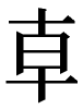
1. Common Ancient Seal Design Techniques
(1) Addition of strokes
The addition of isomorphic radicals to existing characters has been commonly observed in the scripts of the Warring States period. These additions to the usual form, strokes, and keys of the characters are superfluous and non-essential. For example, the character "各" (gè) has been written as "  " in the Chu Silk Manuscript from Zidanku in Changsha and as "
  " in the Xinyang Bamboo Slips, 1.01. The character "月" (yuè) has been written as "
  " in the E Jun Qi Stanza and as "
  " in the Xinyang Bamboo Slips, 1.023. In the Compilation of Ancient Chinese Seals (hereinafter referred to as Compilation) 3400, "
  " (a variant of "重", zhòng) "
  " (a variant of "
  ", chǎn or shàn ) (Pic 1-1) has been written as "
  ", which, after being flipped horizontally, will be "
  ". For examples of how designers have employed this technique in their work, one can refer to Baik Kum Nam's What I Have Thought (Pic 1-2). Taking a close look at this design, we can see that it is made up of the words "學" (xué), "大" (dà), "人" (rén), and "教" (jiào), which can be found on the decorative tiles of the Gyeongbokgung Palace in Seoul, South Korea. This design shows the influence of the Nine-Bend Seal Script (九疊篆, jiǔ dié zhuàn) used in official seals in the Sui and Tang Dynasties in China (refer to Pic 1-3, The Seal of Dutong, Tang Dynasty). Despite being a product of the Bird-Worm Seal Script (鳥蟲篆, niǎo chóng zhuàn) of the Han Dynasty, the Nine-Bend Seal Script lacks the natural beauty of the Bird-Worm Seal Script.
Pic (1-1) Compilation, 3400 (重) ( )
Pic (1-2) Baik Kum Nam What I have thought
Pic (1-3) Nine-Bend Seal Script The Seal of Dutong Tang Dynasty
(2) Simplification of strokes
Many simplified characters appeared as early as the Shang Dynasty (also known as the Yin Dynasty). In the Warring States period, simplification techniques were dominated by conventions such as rendering a character in a single stroke, simplification of complex characters, condensation of form, omission of radicals, loan of strokes and radicals, etc. For instance, "狂" (kuáng) has been written as "

" and "

" in Scripts of Ancient Chinese Seals (hereinafter referred to as Scripts) 10.3. The character "至" (zhì) has been rendered as "

" in the Scripts on the Relics of King Cuo of Zhongshan, 21, and "

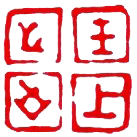
" in the seal Arrival of the King (王上之至, wáng shàng zhī zhì) in Compilation 4903 (Pic 2-1). Such a technique can lend itself to creative expression in modern graphic design.
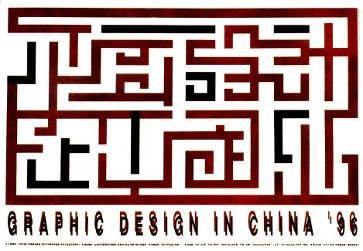
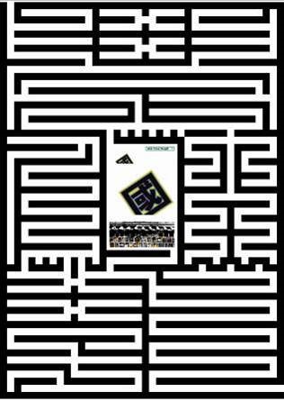
In Pic 2-2, "Graphic Design in China '96", the designer has, by doing away with some of the strokes making up the characters, as well as connecting some of the lines, transformed the characters "平面設計在中國96" (píng miàn shè jì zài zhōng guó 96) into an intriguing design resembling a maze. On first look, it creates an illusion; upon closer scrutiny, the ingenuity of the designer shines through.
Pic (2-1) Compilation 4903 Seal of Qi Arrival of the King
Pic (2-2) Graphic Design in China '96
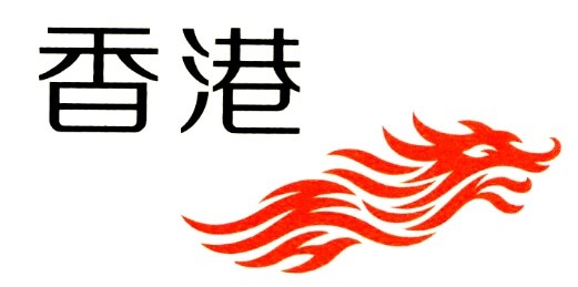
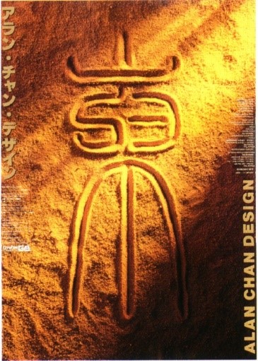
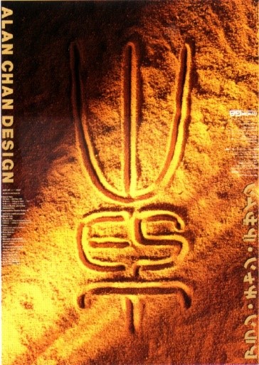
Pic 2-3 shows the logo of Brand Hong Kong. In this campaign, Hong Kong has been positioned as "Asia's World City", and the logo takes the form of a Chinese dragon, a well-loved icon among the people of Hong Kong Special Administrative Region of the People's Republic of China. This design cleverly combines the characters "香" and "港" (香港, xiāng gâng, Hong Kong) in the shape of the head of a soaring dragon. On the left, the character "香"makes up part of the dragon's mane and body. Ordinarily, the bottom of this character would be written as "曰", but it has been simplified into the letter "H" in this design. In the same vein, the lower part of "港" which would ordinarily be written as "巳" has been simplified and transformed into the letter "K", which also forms the open maw of the roaring dragon. All these elements come together in an image of a dragon in flight, a fitting symbol of the Hong Kong people, the Descendents of the Dragon.

Pic (2-3) Asia's World City – Logo of Brand Hong Kong
(3) Sharing components
The sharing of components is a technique used to simplify characters by allowing strokes or radicals to be shared. Due to the proximity of certain parts of a particular character, two adjacent parts can share strokes that are similarly written. This simplification technique was widely used in the Warring States period.
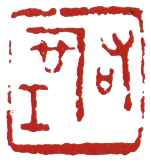
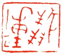
Pic 3-1 shows an official seal of the Jin State, found in Compilation 0090. It says "Seal of The Right Office" (右司工(空), yòu sī gōng/kōng), and the horizontal stroke in the top part of "口" (kǒu) in the character "

" (司) has been moved up and combined with the "一" above it, so that it looks like "

". Hence, the character "司" in this seal design looks rather different from how it is usually written. The technique is commonly observed among seals produced in the Warring States period.
Pic (3-1) Compilation 0090 Official seal of the Jin State Seal of The Right Office
Pic (3-2) Transportation Bureau of Kaohsiung City Government
Traffic sign for "No Temporary Parking along Parking Lines"
As can be seen in Pic 3-2, the sign for "No Temporary Parking along Parking Lines" designed by the Transportation Bureau of Kaohsiung City Government plays on the components of the character "高" (gāo, as in "高雄", Kaohsiung). Two diagonal lines bisect the design, creating 4 "高" that share the "冋" radical. The brilliance of this design is that in it, the character "高" looks identical from all 4 directions, whether it is read top-down, bottom-up, left-to-right, or right-to-left. This sign, used in Kaohsiung City along red lines to indicate "No Temporary Parking" and along yellow lines to indicate "No Parking", is one of the most outstanding designs produced by a public agency in Taiwan.
(4) Ligature
Ligatures represent a very special simplification technique commonly used in the Warring States period. Sometimes, ligatures are indicated by the symbol "=", but sometimes they are not. The presence or absence of the "=" sign does not point to any differences.
Pic 4-1 shows the Seal of Lord Zhao from the Sanjin State of the Warring States period, displaying the characters "卜大夫" (bǔ dà fū, Official of Divination). The "=" symbol marking out the ligature in this seal has been placed below the "卜" character. Such a placement caused Lo Fu-i to mistakenly identify the character on this ancient seal as "上" (shàng) in Compilation. Early scholars have deduced that "大夫" refers to an official title in the Warring States period, based on the following line in Xiangdang, of The Analects of Confucius, "When one speaks to a senior official (上大夫, shàng dà fū), one speaks harmoniously." In the Spring and Autumn period, the Jin State had two titles for officials in charge of divination, namely "卜" or "卜人" (bǔ or bǔ rén) and "筮史" (shì shǐ). According to the chapter on Eastern Zhou in The Annals of the Warring States, during the Warring States period, the official in charge of divination was known as "太卜" (tài bǔ). Hence, the seal should be reinterpreted as "Official of Divination" (卜大夫). The seal can also be seen in the chapter on the Warring States period in Seal Collection of Zhen Qin Zhai, a Macau publication, listed as item 18.
Pic (4-1) Compilation 0106
Seal of Lord Zhao Sanjin State, Warring States period
Official of Divination
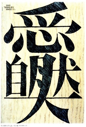
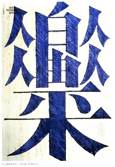
Pic (4-2) Freeman Lau
Love Nature (愛大自然,ài dà zì rán)
Freedom for Everyone (人人自由,rén rén zì yóu)
Peace for All (人人平禾,rén rén píng hé) 1995
Pic 4-2 shows two works by Freeman Lau, namely "Love Nature" and "Freedom for Everyone, Peace for All". In this design series, the artist utilizes the ligature technique to combine several characters into a whole while at the same time still preserving the forms of the respective parts. These works are great exemplars of how ligatures can be used in creative design.
(5) Directional interplay
"Directional interplay" refers to transfigurations in the direction and placement of the radicals in Chinese characters. This phenomenon of the irregularity in written characters can be traced back to the writing systems of the Yin and Zhou dynasties. During the Warring States period, the divergent directives and writing systems among the various states led to an increasing numbers of differences in the directions and placements of radicals. However, the pandemonium of the writing systems back then has also become an excellent model for reference in modern creative design.
Pic 5-1 shows the Seal of Auspicious Saying from the Jin State, as can be found in Compilation 4482. In "千百" (qiān bǎi, Hundreds of Thousands), the way that "百", used as a numeral-classifier here, has been written in the same way that "百" was written in the inscription on the round vessel of the King of Zhongshan that was unearthed from the Royal Tombs of Zhongshan in Pingshan County, Hebei. Chinese scholar Yu Xingwu wrote in his essay "Discussions on the Character ‘bai’" (釋百, shì bǎi), "Our research revealed that the character "百" underwent a process of replication and mutation in the Warring States period, from "

" to "

" to "

" to "

" to "

". The birth of transfigured characters such as this is evidently a result of ideographic characters being written and even inverted over their course of evolution." (See Jianghan Archaeology, 1983, Issue 4 of 4, pp. 35-38.)

Pic (5-1) Compilation 4482
Seal of Auspicious Saying in the Jin State
Hundreds of Thousands
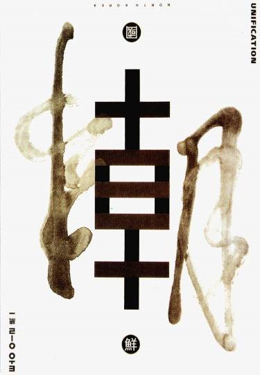
Pic (5-2) Kan Tai-Keung The Trio of Asia Posters, Korea
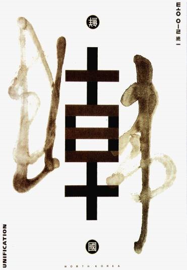
In The Trio of Asia Posters, Korea, as shown in Pic 5-2, Hong Kong artist Kan Tai-Keung plays with the common component “
” in the characters “韓” (hán), which stands for South Korea (韓國) and “朝” (cháo), which stands for North Korea (朝鮮). The artist uses ink splashes characteristic of Chinese calligraphy for the other half of the respective characters (“韋” for the other half of “韓” and “月” for the other half of “朝”) to create a poster design that can be displayed in two ways, either showing “韓” right-side-up or, if one flips the poster 180 degrees, showing “朝” right-side-up. Through the ingenuity of this design, the two Koreas are cleverly unified in this poster.
Pic (5-3) Alan Chan, East Meets West
For the poster for his “East Meets West” solo exhibition (Pic 5-3), Hong Kong artist Alan Chan uses the same design concept in which the poster can be displayed in two ways. In this design, the artist creates the Chinese character “東” (dōng, East) using the Small Seal Script (小篆, xiǎo zhuàn) and, through the clever reduction of some strokes and the extension of others, fuses the English word “West”, which can be seen when the poster is flipped upside-down, into the design. The inventiveness of the designer is captured in the details of his design.
2. Conclusion
The character of seals can be created through the means of seal-crafting, composition, chisel-work, and calligraphy. Composition refers to the layout and artistic arrangement of the elements of a seal and includes considerations such as balanced distribution, density, weight, addition and reduction, curvature and extension, echo, movement, intertwining, interlacing, transformation, divergence and convergence, stylistic flair, gridding, and bordering. In terms of calligraphic expression, artists primarily adopt the variants of written characters from the Warring States period. According to the General Theory of Warring States Written Characters (edited), written by He Lin-Yi, these techniques include (1) simplification, (2) addition of strokes, (3) exotifying, (4) assimilation, (5) repetition, ligature, use of special symbols, etc. The evolution of written characters is a vast field of study under the discipline of Graphemics.
Some techniques that can be adopted in the field of creative design can be seen in the approach of forming pictorial images out of written characters, which is not uncommon in traditional decorative motifs. This technique can be used not only for seal designs but also for stylistic textual designs, logo designs, and poster designs. Due to spatial constraints, only design applications are included in this paper for the reference of interested parties.
3. Reference materials
• (1983). Jianghan Archaeology, 4(4), 35–38.
• Lin, W. Y. (1999). The Art of Chinese Seals. Pingtung County Cultural Center.
• He, L. Y. (2020). General Theory of Warring States Written Characters (edited) (4th ed.). Shanghai guji chubanshe.
• Lo, F. I. (1994). Scripts of Ancient Chinese Seals (2nd ed.). Wenwu Chubanshe.
• Lo, F. I. (1994). Compilation of Ancient Chinese Seals (2nd ed.). Wenwu Chubanshe.